วันอาทิตย์ที่ 23 มีนาคม พ.ศ. 2557

Duck Duck Goose!


My Logical Ethics professor David Lowe ( not to be associated with INDA professor Taylor Lowe) back in high school used to have a saying : "If you walk like a duck, look like a duck, sound like a duck. Then you're a duck! Perhaps Ducks are a big part of western culture as it is used in countless analogies to represent a concrete literal image. From the lecture given by Professor Taylor Lowe of INDA, it has come to my attention that ducks are also a reference in architecture as well.

What exactly are ducks and decorated sheds? The terms "duck and decorated shed" were coined by Robert Venturi in his book "Learning from Las Vegas in 1972. The book states that there are two distinct ways to identifty a building : by what they are, and what they appear to be. The two terms are merely a gesture towards classification of a building's iconography expression but does not define or judge it in any particular way.

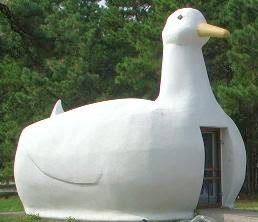
What exactly is a duck?

A duck. referenced from the Duck opt store in Long island that used to sell ducks and eggs literally looked like a duck. Symbolism is the main idea of duck buildings and does not require any label or signs to signify what the building's function or operation are. Ducks are usually between the ambiguous borders of a sculpture and building.


Decorated Shed?
In contrast to ducks, decorated sheds are generic structures with a purpose identifiable only by the signage and lables. It exists merely on signs and labels, not holding any symbolic value of themselves. It relies heavily on ornamentation. We can easily tell what it does, just look at its sign!


Moving on to Crocs : the task of this project is to design a flagship store for the brand crocs, adressing it based on the research provided in the previous phase of the project.


The INDA studio project : Crocs is still under developement, however, its concept and strong aesthetics has drawn my design towards a duck than shed. The main concept of this project is rebranding crocs, using main attraction such as comfortability and functionality. The functionality will mostly reflect the programs going on inside the space while comfortability is expressed with material forms function and lighting that gives a unique experience of the brand. The building focuses on showing the lightweight qualities of the material through fluid flowing forms and does not focus at all on the signage or labels, or external ornamentation.

My most recent proposal depicts crocs as a floating night club, showing no signs or extra ornmaentations, but taking on the continuous, rubberized, and apertures fully representing croc's aesthethics.

Its a duck I'd say. For now.


วันอาทิตย์ที่ 16 มีนาคม พ.ศ. 2557

Branding Architecture

Swiss architect Charles-Édouard Jeanneret, has began branding himself as Le Corbusier, the french word for crow since the year 1920. he portrayed one of the most influential visionaries of the 20th century of the architecture realm, Le Corbusier had created his own distinctive definition of modernist architecture. Influenced by automobiles and their idea of a working machine, he believed that all men had the same need and requirements for a living space. He began is journey to define the universal standards of a living space. The modular, a diagram of human porportion to architecture was one of his creations for setting the standards of human living. Also a writer, Le Corbusier expressed his approach towards architecture in his book : Towards a New Architecture. His ideas circulated around the idea of creating a utopian of mass produced uniform units of living space. He pictured the city acting more of  a "machine" where living space is presented in its most functional and productive method.


For example, one of his (failed) vision for Paris to devise its city plans, Le Corbusier presented his drawing of uniform high rises (with vertical gardens), totally transforming the city in to a gigantic utopian, a super efficient machine. Not all agree with his vision, some claimed that his ideology is his strong support towards his political standpoint, a Fascist regime. Agreeing or not, Corbusier has definitely created a distinctive vision for his architecture. a brand for his architecure.

His 5  standard architectural elements highlighted in the book : Towards a New architecture are : pilotis, ribbon windows, a free facade ( free facade design since it does not play role in any structural loads), Free plan,  and rooftop gardens. His formula is repeated and applied to different structures around the world such as concrete apartment blocks he called a "Utopian machine." Due to post war shortages, raw concrete was also a part of his design.

His architecture became the brand for modernist architecture. Its literally everywhere and presented in every large city around the world. Bangkok, for instance, adopted much of his styles and the Le Corbusier buildings can be spotted everywhere in downtown Bangkok.

In contrast to Le Corbusier's mass production brutalism, a machine-influenced industrial architect Eero Saarinen from America defined his architecture with a much different approach from Le Corbuiser. He designed the TWA Flight Center with curves and steel frames to represent the flight-in-motion. He defined motion in terms of experience rather than efficiency that Corbusier was so attached to.
 
The flight center is represented in the form of wings in flight and complex curvatures to evoke the sense of motion. Saarinen was known for his use of motion-like curvature to create a unique experience in buildings. Although both industrialized and machine-influenced one can completely create their own style and branding of architecture.


 My studio project deals with the shoe brand Crocs using focusing on its Aesthethic, Functionality, comfort and fun. My idea of using the Crocs aesthetics is to recapture Crocs in a setting where Crocs are fashionable. Targeting an age group (that Crocs failed to capture) who would never wear Crocs and an activity Crocs would unlikely be associated with, I tried to create a unique context where Crocs are perfectly fashionable. The flagship store would bring the user to directly experience the materiality and functionality as well as the aesthethics of the brand in a vibrant fashion.  I decide to associate the brand with water, because water holds all the qualities that Crocs is trying to represent, a soothing sense of relaxation an also fun. The flagship store would be a floating building along the chaopraya river, making its aesthethic clearly stand out. As a precedent project in representing the brand, i allude to the rolex building, with continous curves and apertures that is relatable to Crocs. Linking back to the TWA airport by Saarinen, my goal is to manipulate the experience through architecture just like what he had done with the Flight Center. If experience is controlled, the brand image can be manipulated and changed.


.


วันอาทิตย์ที่ 2 มีนาคม พ.ศ. 2557

Space within a Space


Following the First World War, The Barcelona Pavilion, 1929, by Mies Vander Rohe became an iconic representation of German culture: an emulation of the nation’s progressively modern culture following its roots in classical history. The only function the building had to accommodate is as a reception of the King and Queen of Spain as they signed the Golden Book, and official opening to the exposition. It has no official program, and understood by the designer as “just a building.”  The Pavilion was never really in used by anyone, It instead, is understood as sculpture rather than a living space.

As an architecture student, the name “Mies Vander Rohe” and the building, “Barcelona Pavilion,” is often alluded to in lectures and referenced in project introductions. It is Architect’s specialized term for “mainstream.” The space reiterated the modernists concept “Less is more.” Looking at the floor plan drawings illustrated an ultimately simplistic plan. The space is represented in simple white walls with rectangular geometric repetition yet a sense of spatial complexity. Further studies of the pavilion illustrates how Mies created “a space within a space.”  Although the space is represented in a super simplistic fashion, the complexity of the space further advances those of complex plan buildings. It’s the walls.

Introducing the MVP of Barcelona Pavilion: Walls. Specially customized and crafted walls partitioned the interior space of the pavilion, though not closing off the space entirely. Mies chose from only a few materials: glass, travertine, marble, onyx, and steel. Unlike ordinary cookie cutter houses, where materials were often covered up with paint to hide its hideous looks, Mies making the material speak for themselves. For example, the large marble wall running through the pavilion was carefully picked piece by piece so that the natural patterns are matching and coherent with its adjacent piece. The glass reflections and natural lighting results help create and open-ness to the space.

To understand why the walls created such an impact on the pavilion, one must understand the underlying logic behind the designing of the pavilion. The pavilion is designed based on a formulaic grid system developed by the architect. Not only does it serve as the travertine patterns, it is also serves as the framework of the wall orientation s and systems within the pavilion.

Creation of the partitioned space could not have been done if the building was constructed with heavy thick walls and columns. The light weight and floating quality of the architecture allowed for such open space to create a space within a space. Mies used thin columns and low flat roofs to indicate the open-ness of space as it laid low horizontal to the ground. It sets the example and thrive for modernism. It’s the complexity of experience represented in simply architecture.


The pavilion is how Mies Vander Rohe showed that Less is actually, More.